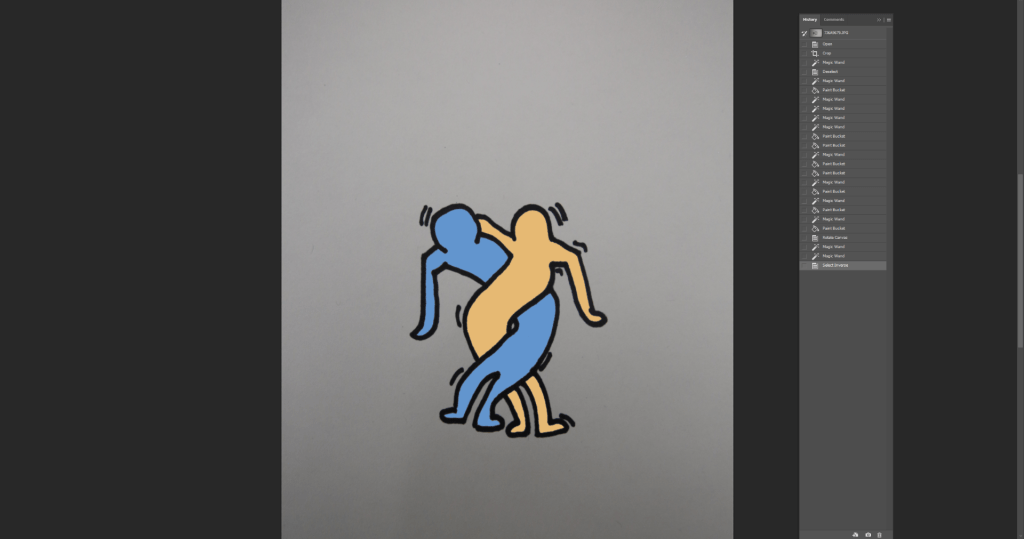
- January 19, 2023 To create a Keith Haring inspired work I wanted my image to express love and partnership. The love i have in myself for others make me feel as if i am intertwined in their life, I matter to the person. Looking at his work I was inspired by the two people hugging and i sketched out my ideas. I felt the background was to be boring with just the people so i placed a heart around shining bright. I also wanted to add lines because in Haring’s work, he was known for it, it was his signature. I traced the image onto a blank piece of paper was i was going to use photoshop to add color. Something difficult I encountered was how to choose the colors, i wanted to create a tribute to my life and use a peachy orange as my color and my partner to be blue. I still experimented with colors but once I figured out what colors I wanted i colored the white space and when on the internet to find a perfect heart. It still felt empty around the sides so i added more color with a gradient. I wanted the color to be red however, it would clash with the color of the heart, so I choose something on the opposite spectrum. I did end up liking the color and placed black dots around to look more “fun.”


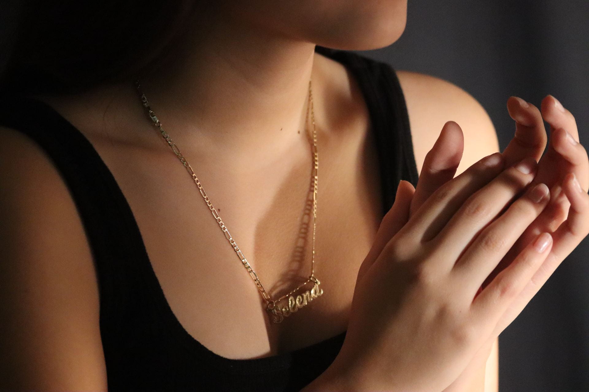
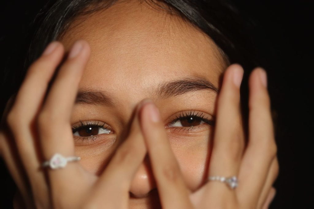
- January 17, 2023, I choose to create a series instead of one photo, so I had another photoshoot and I wanted to emphasize the female features for example the collar bone and the sharp face structure. I felt it was a fail because it was not a close enough image to really emphasize her features. In the process of the photoshoot, I wanted to capture all the lines in a person’s hands however it was difficult to find a hand placement to create an interesting spiral. I wanted for the image to catch the reader’s attention, so it had to be eye captivating. After choosing my best images. they were exported to lightroom and I played with the presets to find what i would like. After I altered the settings to something I liked I used to same setting on my other image to look cohesive. I felt this series was successful because they all show form and shape, they made me feel attracted to the photo because of the linework.


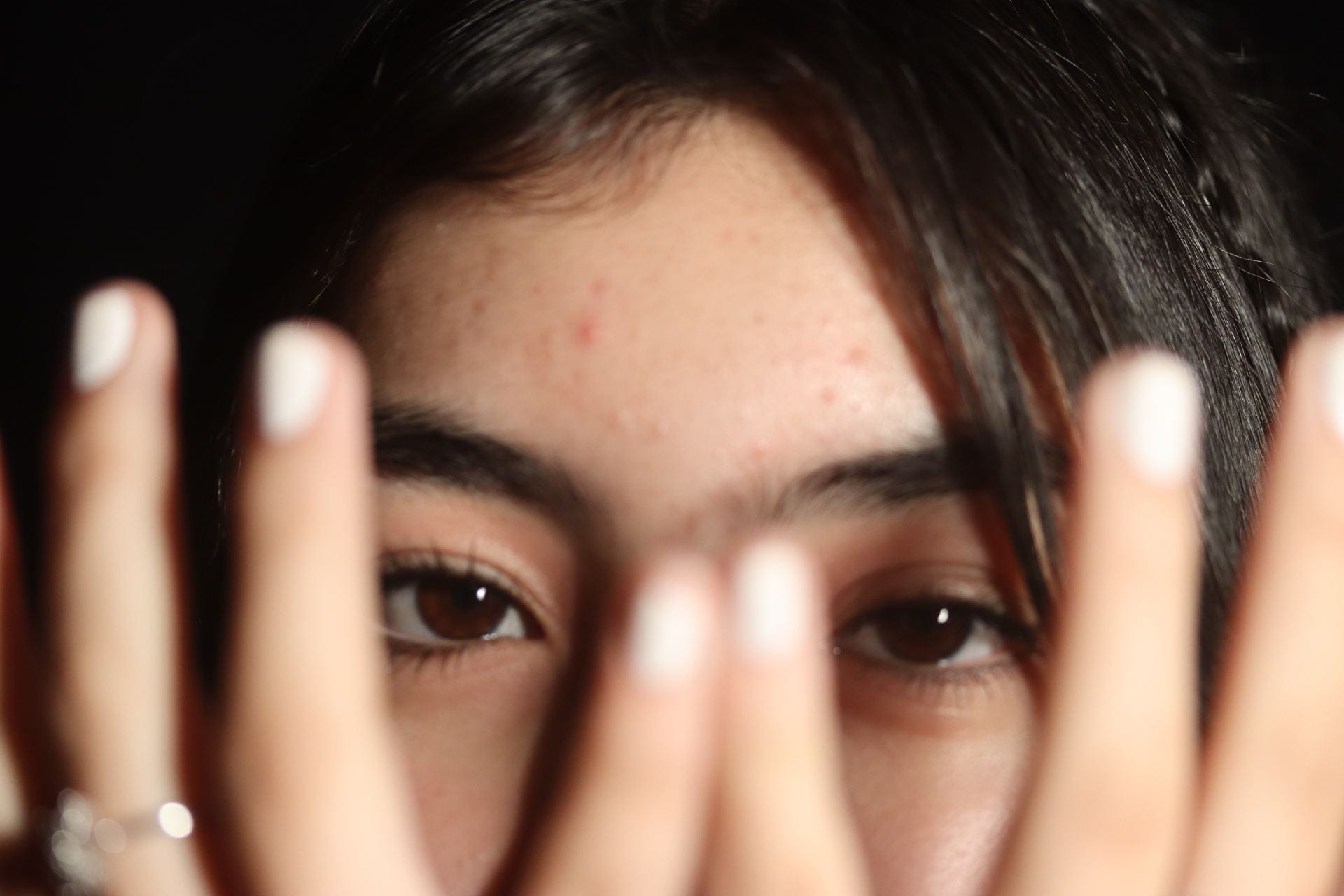
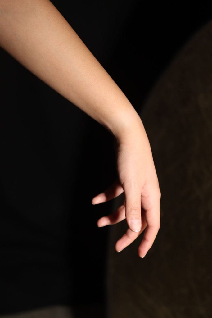
- January 16, 2023- The new assignments was to portray the human body/form and I was inspired to try and recreate a couple holding hands while one is fading away. The difficult part was during the photoshoot I was not sure how to photograph the arms. I was worried my image would be too close to the left or to the right. I want the audience to see the hand and another situation I was delt with was the angle the arms are in; in the first image the arm comes in an angle and in the second image the arm was to straighten. However as I merged the two images i notice a red nail was missing from my hand so i had to try and focus to cover it. To create the fading effect the occupation had to be lowered and I thought if the arm is not seen because the occupation is to low it was defeating the purpose and if it was so visible it would also defeat the purpose. However, once I found the correct percentage the arm should fade, i used lighthouse presets and messed with the settings till i liked it. The end product was successful, it shows the arm fading and the missing nail is not visible. I felt proud of what I had accomplished, it felt like the image reperented a heart break.


- December 7, 2022 In my final attempt I knew I needed to make my message straight forward. When thinking about the reason why parents would ignore their children is their phone. Now in society everyone is attached to their phone, distracted from real life. By placing a phone in the parent’s hand and giving the child blood marks on his head I would showcase the parent ignoring him. This was the end result I thought really portrayed my message.
-

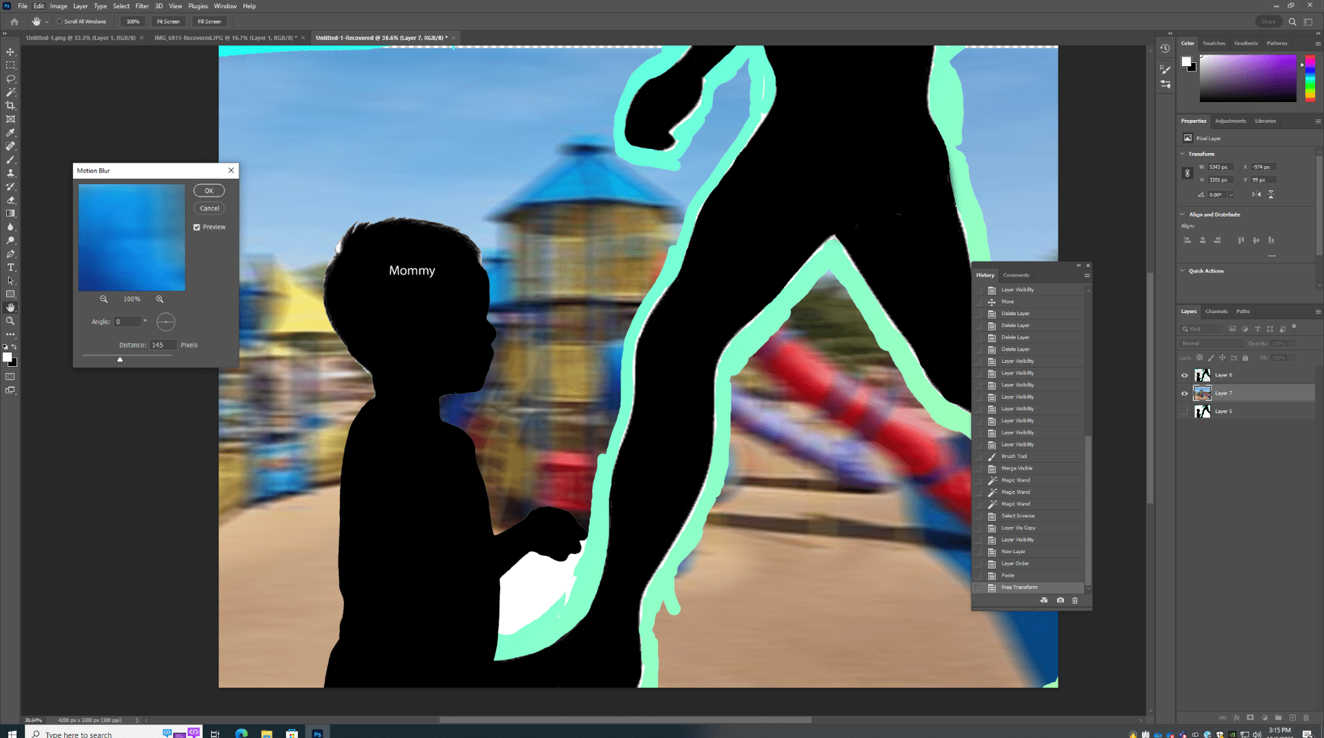
- December 6, 2022 I thought if I tried to create the setting in a playground, it would help the audience to see my message. However, when I tried to highlight the mother’s actions it looked as if the mother was running to his child. I also thought if I created text to speak my message it would help however, it did not have the impact i wanted.

- December 5, 2022 In my new assignment I had to create an image that would create a statement. I wanted to explore the idea of child neglect. From hundreds of years ago till now in modern society children are always ignored and I wanted to present this idea in a collage. I first thought of creating an image that reveals to the audience the child is being ignored from his mother. I choose the background to create a sense of the child being told to leave the mother alone. However, when gathering piers opinions, they thought the message was to not cross the street without mother. I knew I would need to start over.

- November 17,2022
 I did not like the finished project; therefore, I started over again. I began by making two layers in photoshop. On one layer I created a pink and blue gradient and on the other layer i did a border with the same colors. After the two were finished i merged them into one layer creating this finished product. I enjoyed this mixed media.
 - November 16. 2022

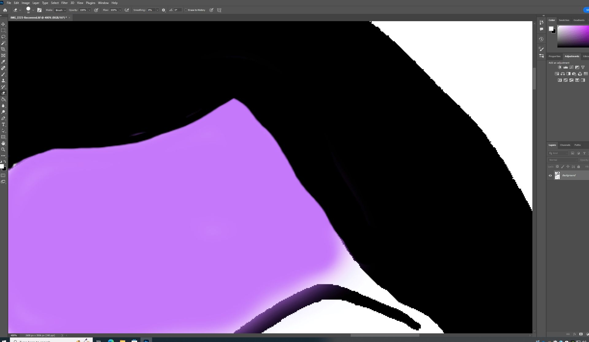
 After the entire image was colored with the same water filter, I went over the water with a neon green filter.
 - November 15, 2022 When i finshed the first face i did not have a clean look so i chose to start over and do a new technique. I color filled the entire image with a water filter. When i tried to change the filter to a solid color it did not work so i continued with the water filter.

- November 14, 2022 For the mixed media assignment I wanted to color in each person to give them a different skin color. I first begin by zooming close into the image and color the lines. I noticed using the brush strokes created an opaque color towards the outside so I would use a black pencil to fix the lines. I continued this for the rest of the images face.


- November 7, 2022 Today I began the printing, I prepped my shirt by placing a carboard in-between the shirt to not let the letters smear on the other side. I placed the vinyl canvas on the shirt, and I was worried for the shirt placement. I had someone hold my canvas while I drag the paint across. After 3 swipes across my shirt I lifted the vinal and blow-dried the paint to leave it cured. I was impresses with the final product.


- November 2, 2022 The process begins with a vinyl canvas that needs a thin layer of uano photo emusion, if it was not thin enough bubbles will form that will not leave a clean finish. Once dried over 24 hrs. I place my image over the vinyl image and leave it in direct sunlight for 18 minutes to burn the image on my canvas. I noticed someone bumped into my canvas while it was burning but I didn’t think much of it. However, in the final product the letters shifted which left the letters unreadable. I would need to place duct tape on the letters, so the paint does not make the messed letters to appear on my shirt.


- November 1. 2022- I choose a family image to create many shirts for my family. One of the problems that would occur is if my lines are to think if any part of the picture, they will not show on my shirt with the fabric paint. Because of that i went to photoshop and with the pencil tool I traced over the braids of the girl on the bottom right. In the design process I noticed the lines became thicker, so I proceeded to print the image. When printing I noticed no mistakes.


- October 31, 2022 The new task was block printing, I was introduced to the materials needed which was the solution, uano photo emusion, and the scraper to spread the solution around. The process was placing the solution on the scraper to then slowly distributing the solution in a thin layer on top of a vinal canvas.. It was important to place a thin solution or bubbles will come out on my canvas.
-


- October 22, 2022 When looking over all my images i found some images that did not work the way I intended however with lightroom i was able to learn how each setting is important.
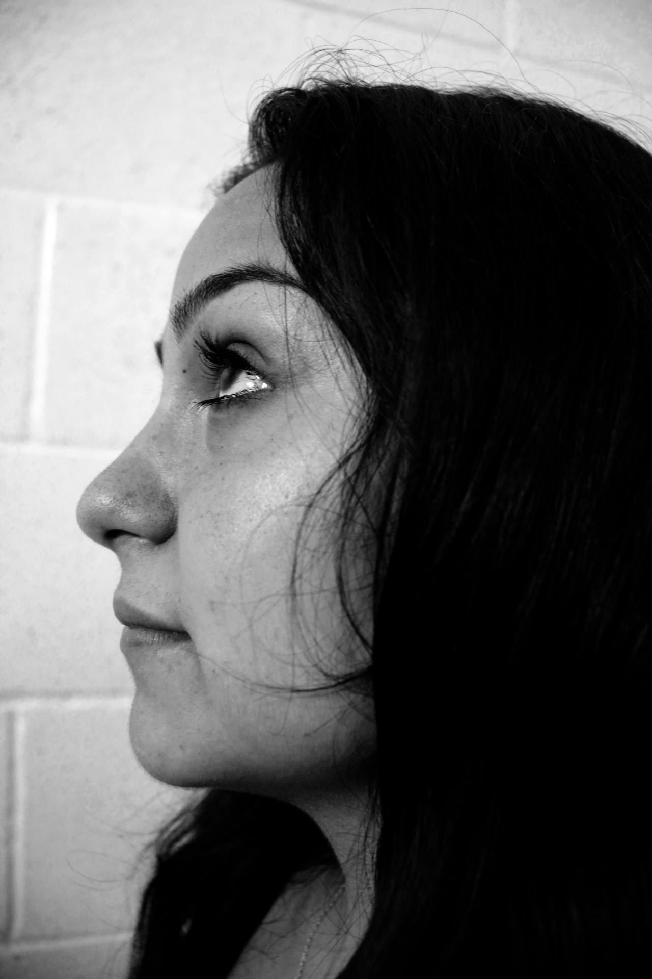
- October 21. 2022 I tried to photoshop my images however I could not chnage the lighting to how i wanted so i switched my app to Adobe LIghthouse. I choose a similar preset filter for all of my images however i still felt to change the image. It really captureed each feature of my models. For example in the image below you can distingish each feature

- October 20, 2022 During the photoshoot I had trouble finding area with a clear background. The reason I wanted an empty back group is because in my photos I wanted to emphasize my model. I was able to recreate the two images I wanted. Although they did not come out exactly how i wanted it, it created a good result. For each pictrure they took many trials trying to find the perfect angle.


- October 19, 2022 Today I focused on selecting the images I want to recreate for my collage. There are two main image I really hope to recreate. To recreate these, I would need to be next to a staircase to enhance negative space around my model so all the focus is on her.


- October 18, 2022 The new assignment was to create a photo series which I choose to photograph elegant images in monochromatic filter. I wanted to focus on one model in different locations doing different positions.
- October 17. 2022 In photoshop I hoped to edit the hands to be blurrier and to have a darker lighting. Although it did help create the hands not so define, I still had problems with the lights. The final product did not turn out how I wished however it is progress
-

- October 14, 2022 For my last image to recreate I need to analyze how to place my model’s hands and the angle of view. My concept was to place the hands away from the face however the canon would lose focus on the eyes. I choose two different models to give me options on which I believe is the similar image to my inspiration. My first image gave me an idea of how not to place the model’s hand. Seeing how not to place my model’s hands was progress because it was one step closer to perfection. I notice in my first trial it had a shadow which was caused by the placement of the light I had.


my other model 
my first trial - October 13, 2022, The main difference I notice from my image and the image I wanted to recreate was a different tint, mine needed to be more orange like. I choose to add saturation on my image to change the entire photo’s tint.

- October 12, 2022 After school I went to the beach with friends and family and an image I wanted to recreate was in a cave. I did not find a cave at the beach i was at however, I used a tunnel covered in sticks to recreate the same allusion. The photo was taken on my phone.

- October 11, 2022, I focused today on photoshopping my image from yesterday. All my trials had some errors but there was one picture I thought had the same camera angle as my inspiration. They had similar blue to red ratio and in photoshop I noticed my picture was darker than the inspiration, so I placed a grey texture film over my image to bring out the lighter blue.


- October 10, 2022 Today I began my shoot, I wanted to choose the easiest image to recreate which is shown in the left image. It was the blue and red image, so my set up included a red and blue color light. In the beginning I struggled to really show the blue color because it was too bright. The solution I came up with is to place a dark blue film over the light which did come out better. My first trial was a horizontal frame which was incorrect, so I needed to flip my camera to get the correct camera angle. After many trials I figured how the light should be placed on her face to get the correct lighting.
-

my first trial 
- October 4, 2022, Because I finished with my block printing assignment, I was about to start on my recreational image assignment, but I realized the images I choose to recreate were too difficult, so I choose something simpler. For example, the image below was too difficult for me to recreate in my opinion
-

- September 30, 2022 I did my final product today and I continue to run into the problem of adding to little paint however, I was happy with the end result. I was debating whether I should paint the inside of the figure to have a more finished look but after consulting with my teacher we both came to agreement the figure looks better the way it does now. I still choose to paint a second coat of the red to really enhance the heart.

- September 29, 2022 I did my final trial which improved from last time. The heart in the middle was painted red instead of white to have better contrast against the back. The mouth did improve however, I still have the problem of applying the paint to lightly.

- September 28, 2022 Before I did my final project on my frame, I noticed it was to plain therefore to improve I needed to add more designs. I choose to create swirls with the white pain to have some contract and it will look good with my figures on top to represent their love mixing and combining together.
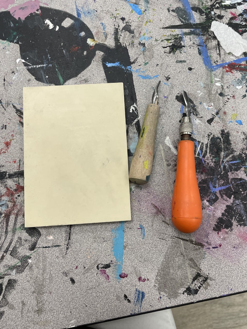
- September 27, 2022 I recoated my wood frame white because the first layer was not enough. Today I wanted to focus on fixing my mistakes. I noticed yesterday I needed to carve deeper around the mouth. When I tried to fix my figure on the left, I carved an uneven smile. I’m worried how it will come out in paper. However, when I carved out my female figure the outcome looked better and you do not see the mouth outline funky.

- September 26, 2022 Now was time to do a trial stamp and see what I need to improve on. My first trial was on the orange paper and my mistake was I did not coat my figures with enough paint to capture each detail. Another mistake was I did not carve deep enough around the mouth because they look like one glob of paint. For my second trial it was on the green paper, and I did a better job applying paint however it was not distributed evenly.
-

- September 23, 2022 For today I wanted to focus on the wood frame and paint it white so my figures will stand out. I also finished carving out my image; it was difficult to carve out the mouth because they are so detailed.

- September 22, 2022– The assignment for class was to choose photographs you would like to recreate, in the process of choosing pictures it inspired me to recreate so many pictures. It was very difficult to narrow it down to only three pictures. Their is so much in the world that is photograph it is never enough. People are so talented to have created such amazing pictures.
- September 21, 2022– Class was a continuation from yesterday, it included me carving out my image to block print. To begin was very difficult for me because I would second guess my decisions however, towards the end of class I became more confident in using tools.

- September 20,2022– In class we were told of our new assignment which was block printing. I wanted to do a drawing revolving around love therefore, I choose the Jack Skellinton and his partner Sally. The original picture I wanted to carve was to difficult so I chose something simpler. I only began drawing my picture on my canvas to begin carving out tomorrow.

- September 19, 2022 -Today in class we went over all of the student’s surrealism project and I felt very included today. When students talked about my surrealism image being a picture that had an impact on them, it felt very special to me because I am not used to people calling out my work.